


As part of our countdown to the new year, here are Heritage’s top five must-see charts of 2013.
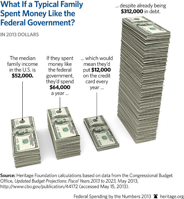
5. What If a Typical Family Spent Money Like the Federal Government?
While middle-class families are still plagued by a sluggish recovery in the Obama economy, this is what their finances would look like if they spent money like the government—and it’s not a pretty picture. Most families understand that it is unwise to constantly spend excessive amounts compared to what they take in, but the government continues its shopping spree on the taxpayer credit card with seemingly no regard to the stack of bills that has already piled up.
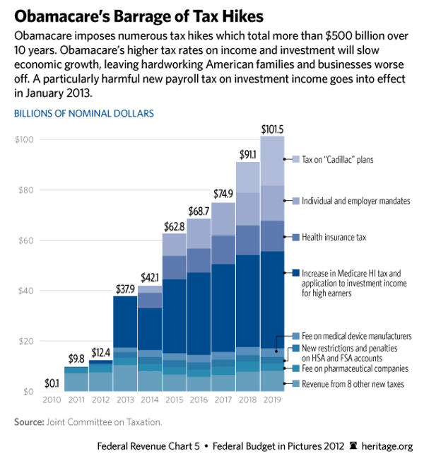
4. Obamacare’s Barrage of Tax Hikes
Remember President Obama’s promise that he would not raise taxes on the middle class? Much like his pledge that Americans could keep their health insurance, this turned out to be another promise Obamacare was bound to break. As this chart shows, tax hikes included in Obamacare are huge and pervasive, amounting to hundreds of billions of dollars in new revenues. Since this chart was published, new numbers for Obamacare’s taxes have become available, and a study by Heritage’s Alyene Senger shows that Obamacare will impose even more in taxes—amounting to a whopping $771 billion in new revenue through 2022.
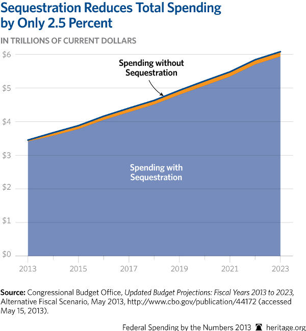
3. Sequestration Cuts Only 2.5 Percent of Spending
As it turns out, sequestration isn’t much of a “meat cleaver” after all. While the sequester is an imperfect mechanism to reduce spending, as the brunt of the cuts falls disproportionally on defense, it only amounts to a 2.5 percent reduction in spending over 10 years. This hardly lives up to the President’s warnings that the cuts would be “harmful” to the economy and would decimate government services. As you can see, the U.S. has a long way to go to rein in its growing spending.
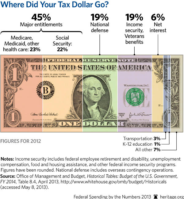
2. Where Did Your Tax Dollar Go?
Wonder what happens to your hard-earned cash after you hand it over the IRS each year? Almost half goes toward paying for the ballooning entitlement programs—Social Security, Medicare, and Medicaid—a proportion that will only increase as the number of retirees expands in the near future. Even worse, your tax money only funded 70 cents of every federal dollar spent in 2012, meaning the remaining 30 cents was borrowed and tacked on to the massive national debt.
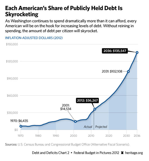
1. Each American’s Share of Publicly Held Debt
As Washington lawmakers continue to spend more and pile on debt, each American’s share of public debt has risen to $36,000—about six times more than in 1970—and is set to rise astronomically in coming years. Without reform, the government will have borrowed $135,547 in public debt for each American, or almost three times the current median income, by 2036. This chart shows that serious consequences lie ahead if the government continues on its current path of reckless spending with no reform in sight.
To address the serious issues highlighted in these charts, Congress must put America on a path to balance by reforming the major entitlement programs—Social Security, Medicare, and Medicaid—that are the key sources of higher spending and debt. By implementing entitlement reforms and discretionary spending cuts, Congress can lift a tremendous burden off the economy, freeing up resources for investment in jobs and growth in the private sector.
Quick Hits:
- Who deserves the awards for the year’s worst reporting?
- Meet the man who is confronting the anti-Christian bias of the American news media.
- In this South American country, Christmas shoppers were muscled aside by looters.
- The incandescent light bulb is the new symbol in the fight for consumer freedom.
- How much screen time is too much for kids?
- Republicans hold a slight advantage in a generic ballot for control of Congress, according to a new CNN/ORC International survey released yesterday.
- President Obama’s job approval, meanwhile, dropped to 39 percent.